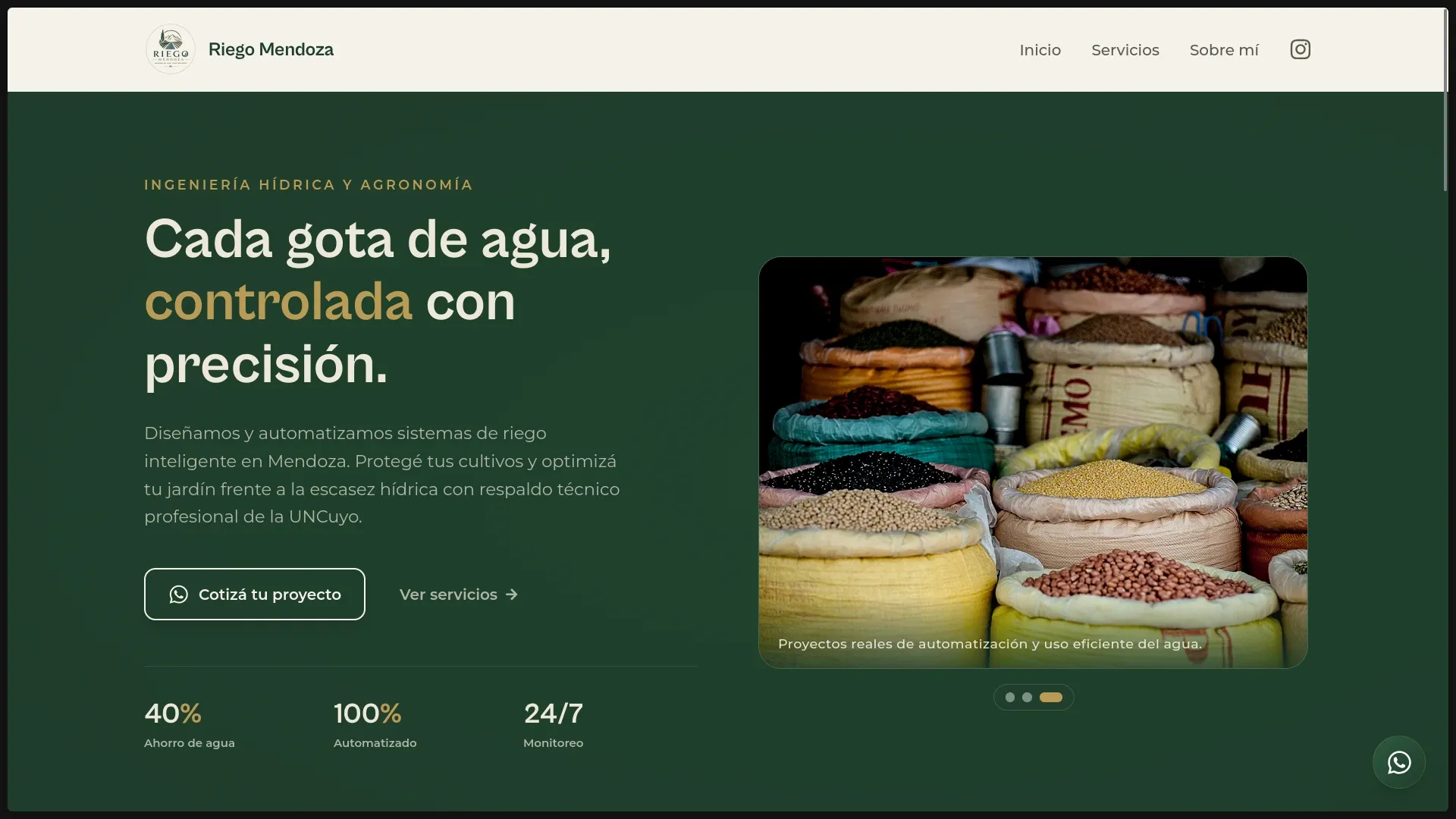
In one sentence: I translated a specialized irrigation service into a website that a vineyard owner, contractor, or homeowner can understand from a phone in the field.
The problem
Riego Mendoza works across automated irrigation, infrastructure, auditing, and hydroponics. That expertise is valuable, but it also creates a communication problem: a long technical catalogue can overwhelm a visitor before they understand which service fits their situation.
The project therefore had two jobs:
- establish a credible digital presence for the business;
- turn an imprecise visit into a useful first conversation.
My role
I handled the product framing, visual direction, frontend implementation, responsive behavior, and contact journey. I also organized service content as data rather than embedding every detail directly in the UI.
From service list to decision path
The page is structured around the questions a potential client asks:
- What problems can this team solve?
- Do they understand agricultural and residential contexts?
- What does each service involve?
- How can I ask for an assessment without filling out a long form?
Service cards provide the first layer of information. FAQs answer common objections. Repeated but restrained calls to action let a visitor contact the business when they have enough context.
Design system rooted in the place
I avoided the generic blue palette common to engineering websites. The interface combines:
- deep moss green for agricultural context;
- warm gold for high-intent actions;
- cream surfaces for readability;
- water imagery and restrained motion for continuity.
The result feels connected to Mendoza without turning the page into a visual cliché.
Engineering decisions
React without unnecessary application complexity
This is a focused commercial site, not a dashboard. React components are used where they improve maintainability—services, statistics, FAQs, navigation, and repeated UI—but the architecture stays intentionally small.
Content separated from presentation
Service definitions live in JSON and are rendered by reusable components. That makes wording, ordering, and future additions easier to manage without duplicating markup.
Mobile contact as a first-class flow
A floating WhatsApp action and contextual contact links remove friction for visitors already using their phones. The message starts the conversation; it does not pretend to replace the technical diagnosis the business still needs to perform.
A conversion is not a click on WhatsApp. It is the start of a conversation with enough context to be useful.
Current result
The delivered site includes:
- a responsive React interface built with Vite;
- modular sections and reusable UI components;
- service data separated from presentation;
- scroll-triggered motion with reduced visual noise;
- FAQ and contact paths designed for mobile use;
- semantic metadata for the business and its regional audience.
What I would improve next
- Add privacy-friendly analytics for service interest and contact clicks.
- Validate the copy with real search and enquiry data instead of assumptions.
- Introduce project case studies with concrete before-and-after outcomes.
- Run recurring accessibility and performance audits as content changes.
Stack
- UI: React 19
- Build tool: Vite 8
- Styling: Tailwind CSS 4
- Icons: Lucide React and React Icons
- Content: local structured data
- Deployment: Vercel