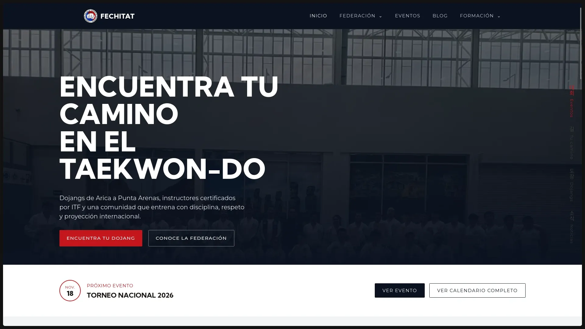
In one sentence: I replaced a fragmented institutional presence with a website that helps people understand the federation, find an affiliated school, and access official information without getting lost.
The context
FECHITAT is the Federación Chilena de Taekwon-Do Tradicional. Its website has to serve very different visitors: families discovering the discipline, current practitioners looking for study material, instructors managing their school’s visibility, and federation members checking events or documents.
That made this more than a visual redesign. The real problem was information architecture: how do you make a federation feel trustworthy without making its website feel bureaucratic?
What I was responsible for
I designed and built the public website from the content model to the responsive interface. The work included:
- defining the navigation and page hierarchy;
- creating a visual system inspired by ITF belt colors and Korean typography;
- building reusable Astro components for timelines, events, statistics, tags, and page headers;
- connecting editorial content to Sanity;
- implementing the school directory, search, and regional filters;
- adding technical SEO, structured data, social metadata, and accessible interaction states.
The decisions that shaped the product
Content first, animation second
Federation websites can easily become a collection of decorative pages. I prioritized the questions visitors actually bring:
- What is FECHITAT?
- Where can I train?
- What event or examination is next?
- Where are the official documents and study materials?
Animations and visual details support that path; they never replace it.
Astro for the public experience
Most pages are content-heavy and do not need a client-side application. Astro lets the site deliver semantic HTML by default and reserve JavaScript for interactions such as filters, navigation, and counters.
This keeps the reading experience fast on mobile devices while preserving a component-based codebase.
Sanity for structured institutional content
Events, schools, blog posts, federation members, documents, and study resources each have different fields and publishing needs. Modeling them as structured Sanity documents avoids hard-coded content and gives editors one consistent place to update the site.
The school directory is a good example: entries can be grouped by region, searched by name or city, linked to an individual school page, and exposed as SportsActivityLocation structured data.
A detail I wanted people to remember
The interface uses a thin belt-color rail as a recurring navigation motif. It is not decoration added after the fact: it connects the visual identity of the site with the progression system every practitioner already understands.
The best institutional design does not shout. It makes the organization feel clear, current, and dependable.
Current result
The current build provides:
- dedicated paths for families, young practitioners, schools, events, examinations, and federation history;
- a searchable directory of affiliated schools;
- editable content powered by Sanity;
- responsive layouts and keyboard-visible controls;
- canonical metadata, sitemap support, Open Graph data, and Schema.org markup.
I deliberately avoid publishing a permanent Lighthouse number here: performance is a moving target, and a reproducible audit is more useful than a marketing badge.
What I would improve next
- Restore and verify the public domain:
fechitat.cldid not resolve during my 3 September 2026 content review, so I removed the broken live link from this portfolio page. - Replace the remaining placeholder material with a complete editorial dataset.
- Add automated accessibility and end-to-end checks to CI.
- Measure the two outcomes that matter most: successful school discovery and completed contact actions.
- Give federation editors a short publishing guide so the content system remains consistent over time.
Stack
- Framework: Astro 7
- Content: Sanity
- Styling: Tailwind CSS 4
- Language: TypeScript
- Interactive directory: client-side search and regional filtering
- Deployment: Vercel